602 Enterprises
-
Project Summary
- Overview
- Market Analysis
- User Research
- Wireframing
- Styling & Content
- SEO
- Final Result
designing to a wide range of Campuses and businesses of all sizes.
Working on this project, not only was I aimed to design a platform targeted to campuses and businesses. I also wanted to optimize keywords to bring these two groups onto the main website. I worked long hours to design an idea to help understand different competitors in the market, understand the target audience, and design and then implement content onto the website. The challenge I faced when working on this project, was understanding the two audience groups and tailoring each page specifically to them, and also matching what my clients were looking for. I broke down this project into three stages. The first stage was designing three pages about the company, store, and quote form. The second stage was implementing the campus, business, and service pages onto the website. The final step is keeping the website maintained and updated within time. I was optimistic about assisting these 602 Enterprises grow and building their online platform to sell merchandise, custom apparel, and digital marketing.
Step One: Market Analysis
For the market research, there were numerous examples of websites that centered around Greek life as well as businesses. I evaluated a great market, each having what works for them and flaws that don't work. In my research, I researched what was in the market to formulate a proper design choice tailored specifically to 602 Enterprises. I picked two competitors that would best rival 602 Enterprises. The first competitor is Hittn Skins, a screen printing company based in Orlando, Florida that provides custom apparel, vinyl designs, and branding materials commercially and residentially. The second competitor is JNJ Apparel which creates apparel for businesses and campus life like sororities and fraternities. Both are great websites that answer user needs in creating designs and apparel for students or businesses. But what makes both of these websites work and what doesn't work? That is the question I am going to answer.

I created a criterion table that helped me evaluate the total content inside the website. My biggest takeaway when it came to the design, especially Hittn' Skins, noticed there were too picture-heavy, and much of their work was covered by the text, like their cover image. You can't see the design, since they have text in front of it. JNJ Apparel, their home page contains three columns and more details about their brand. One of the most prominent issues I have with this is that no action statement expresses why users should select either of those columns. This is missing and can help users understand what they offer and IF it is aimed toward them. To see the pros & cons of both competitors, click this link to see more.
A major issue for both websites was that they had to know how users sign up, and do they need to build a quote. email first? Especially JNJ Apparel which allows you to shop in their store. They had a great catalog as well as targetting businesses for quotes. Overall this helped me see what worked and what didn't to target their main audience.
Step Two: User Research
Identifying what is in the market helped me understand what I needed to build a design tailored to the target audience and I already know who my clients want to target. But campus life and businesses alone can be a very broad audience group, there many businesses and campuses out there. I want to know the TYPE of students on campus that will use it and the TYPE of businesses that can use this website as their supplier. I created a user analysis to break down four types of users that can help identify those broad groups.

Frats and Sorrorities
The first audience group are campus students apart of fraternities or sorrorities. 602 enterprises is focused on supplying and designing shirts for and satisfying their needs when it comes to printed apparel.
Small Businesses
A major target group that 602 Enterprises wanted, was small business owners like owners of bars, gyms, or local restaurants looking for custom apparel, marketing, and prints to use for their business. Frats and sororities are the primary target groups to focus on.

Other Campus Life
Another type of campus life to target is college students' part of extracurricular activity. Students looking for custom apparel for their groups are also someone to shift the focus group on but are a Secondary target group.
Commercial & Residential Estate
The final group is commercial and residential estates like apartment complexes, real-estate companies, and commercially owned businesses. Like other campus life, commercial & residential estate is a secondary target group.
I implemented an empathy map that can help me identify what the user will say, think, feel, and does. I used Ashley Lin as an example of someone who is part of a sorority and is looking to create custom shirts for her sorority sisters. She has been looking online for the best businesses that are either around her or have a great rate. This empathy map showcases that Ashley needs a company that will be good in quality and supplies her with a bundle of apparel. How did I understand who Ashly is and what can help me help her design a website that compliments her needs? That's what empathy helps me with and aims to be helpful when coming up with a design.

Now that I have an idea of the type of user necessary to target 602 Enterprises. I create a user profile to help identify WHO the person is and how this lives their life, and how they fit into 602 enterprises. I breakdown the user profile by who the person is, their values, goals, traits, motivation, and frustrations. All this helped me create a case for someone that I could help build around and understand on a personal level who the audience is.

While I have created the user profile, I designed a SWOT Analysis that will help me understand the business aspect of 602 Enterprises, like Strengths, Weaknesses, Opportunities, and Threats. Making the SWOT Analysis will help me diagnose realistic problems that can face 602 Enterprises and also excellent reasons why it will function.
Strength
- Can be beneficial for students and businesses to create apparel and products for their business and campus life.
- Fraternity and Sorority can find fast and easy print designs for their apparel.
- Small businesses can choose or create merchandise and custom print designs on products to use for their business or sell.
- Allow purchasers to see a catalog and gallery of design choices.
Weakness
- Oversaturation of custom prints can be hard to keep track of active competitors since there are a lot of competitors.
- Not allowing other customers that want to purchase custom apparel can affect the business side of things.
- Commercial businesses can be hard to reach out to since 602 Enterprise is just starting.
Opportunities
- New businesses, especially locally can find an affordable and easy process of creating apparel and product prints.
- Frats and Sororities can expand beyond Florida and can reach out to others in different states that can help grow 602 Enterprises and easier for users to create apparel.
- Creating the target group for Students and Businesses helps keep a steady group to design.
Threat
- The oversaturation of the market can be a major threat to selling and even expanding the audience group.
- Finding a strong marketing technique can be difficult as many larger businesses may not want to work with a new company without results.
Step Three: Wireframes
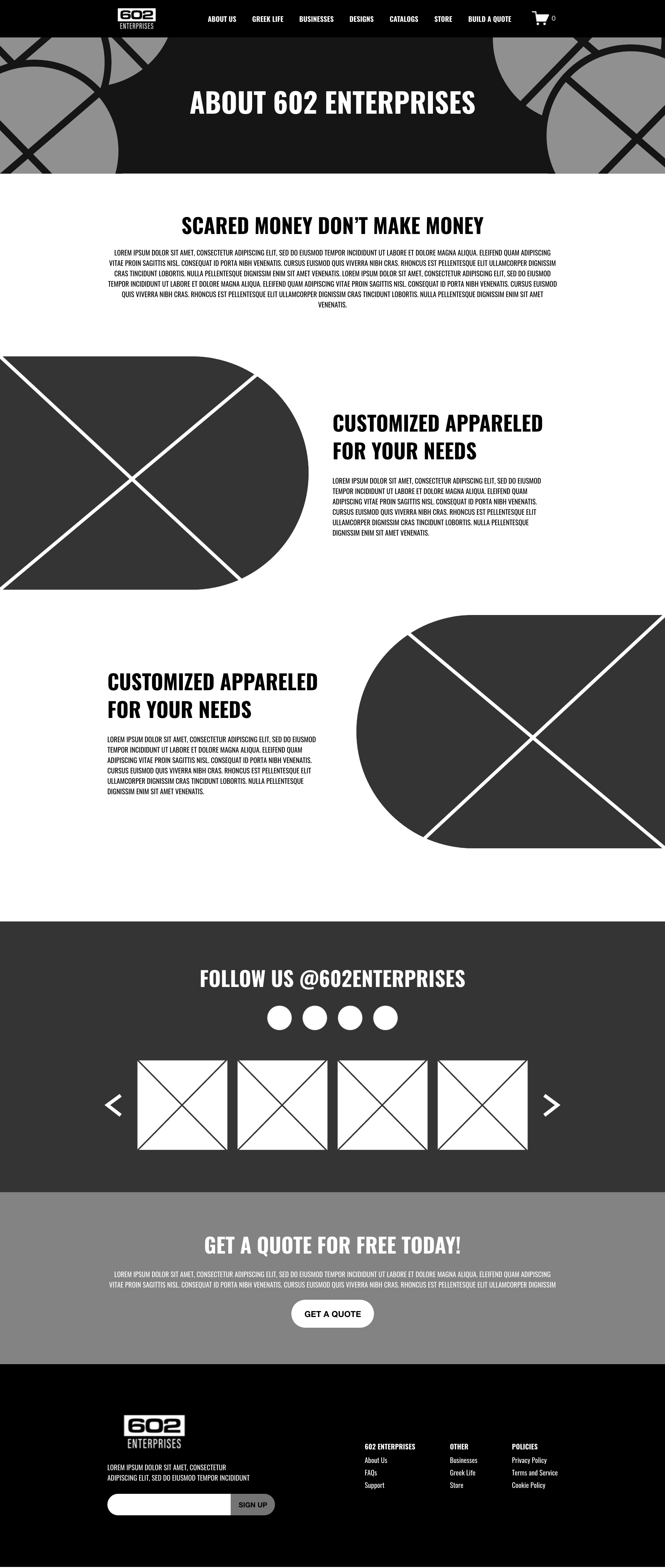
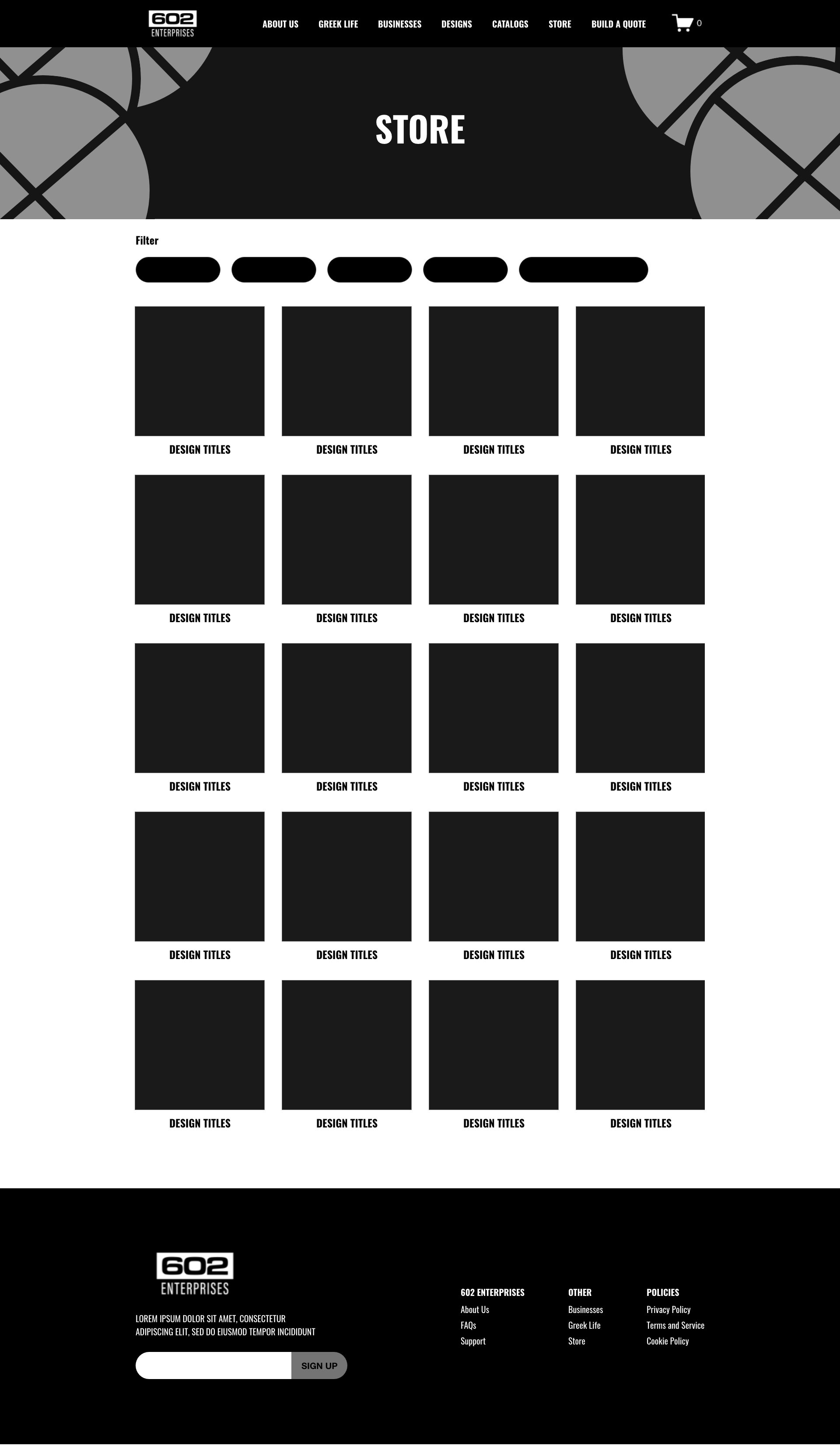
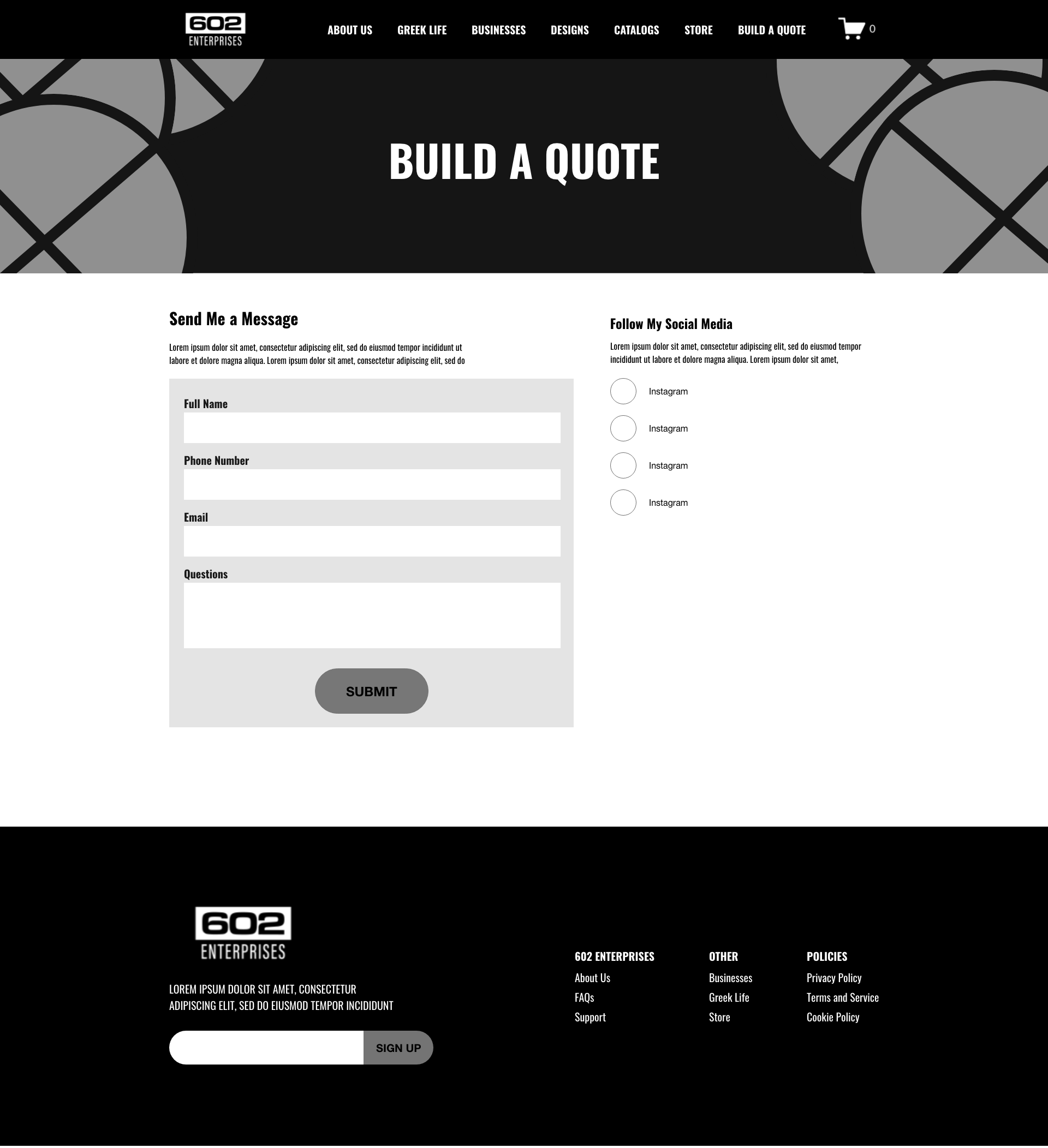
As Steve Jobs once said, "Design is not just what it looks like and feels like. Design is how it works." I know how important a design looks, but is very important that a design WORKS. Before designing my website, I like to create a black-and-white mid-fidelity design that will help show the client how the website will flow. This will help me lay the ground work to eventually add color, content, and graphics. To see the complete mid-fidelity design, click this link here!



Responsive Design

Step Four: Styling & Content
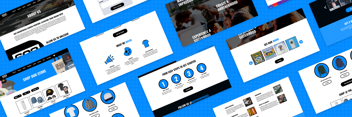
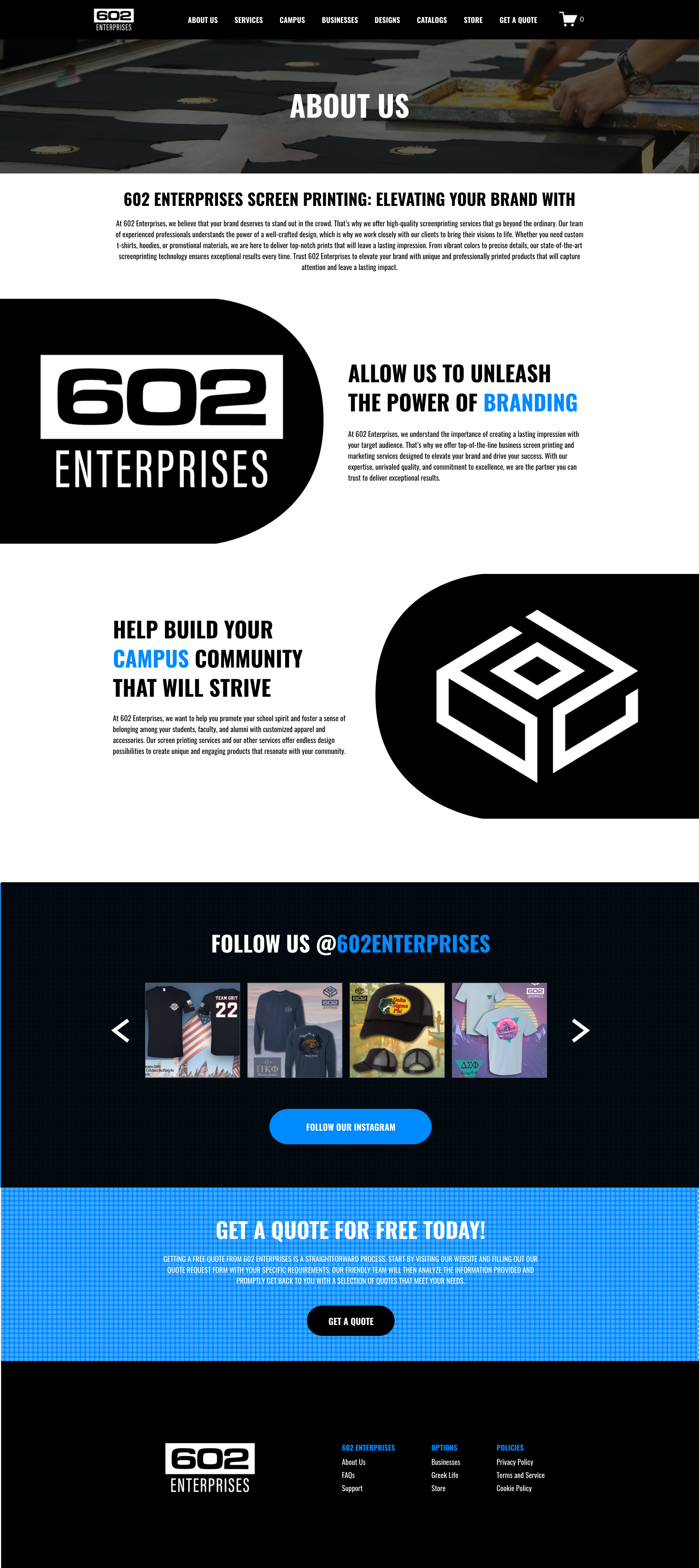
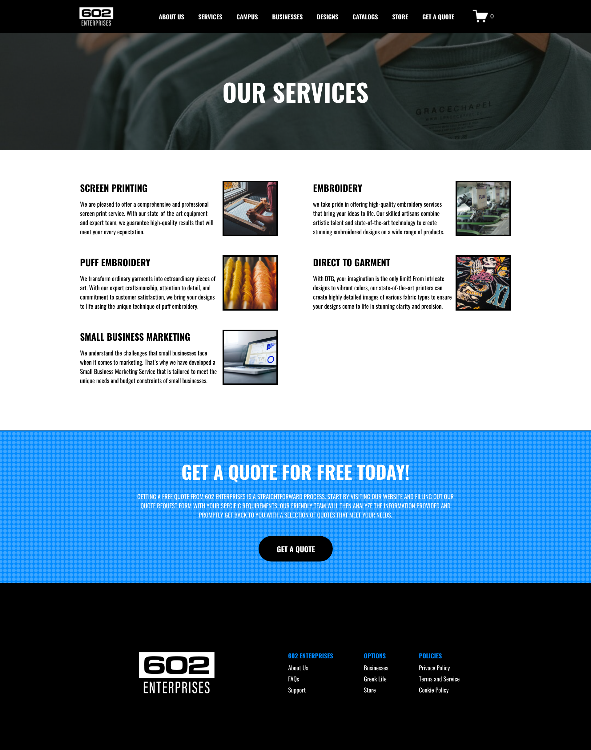
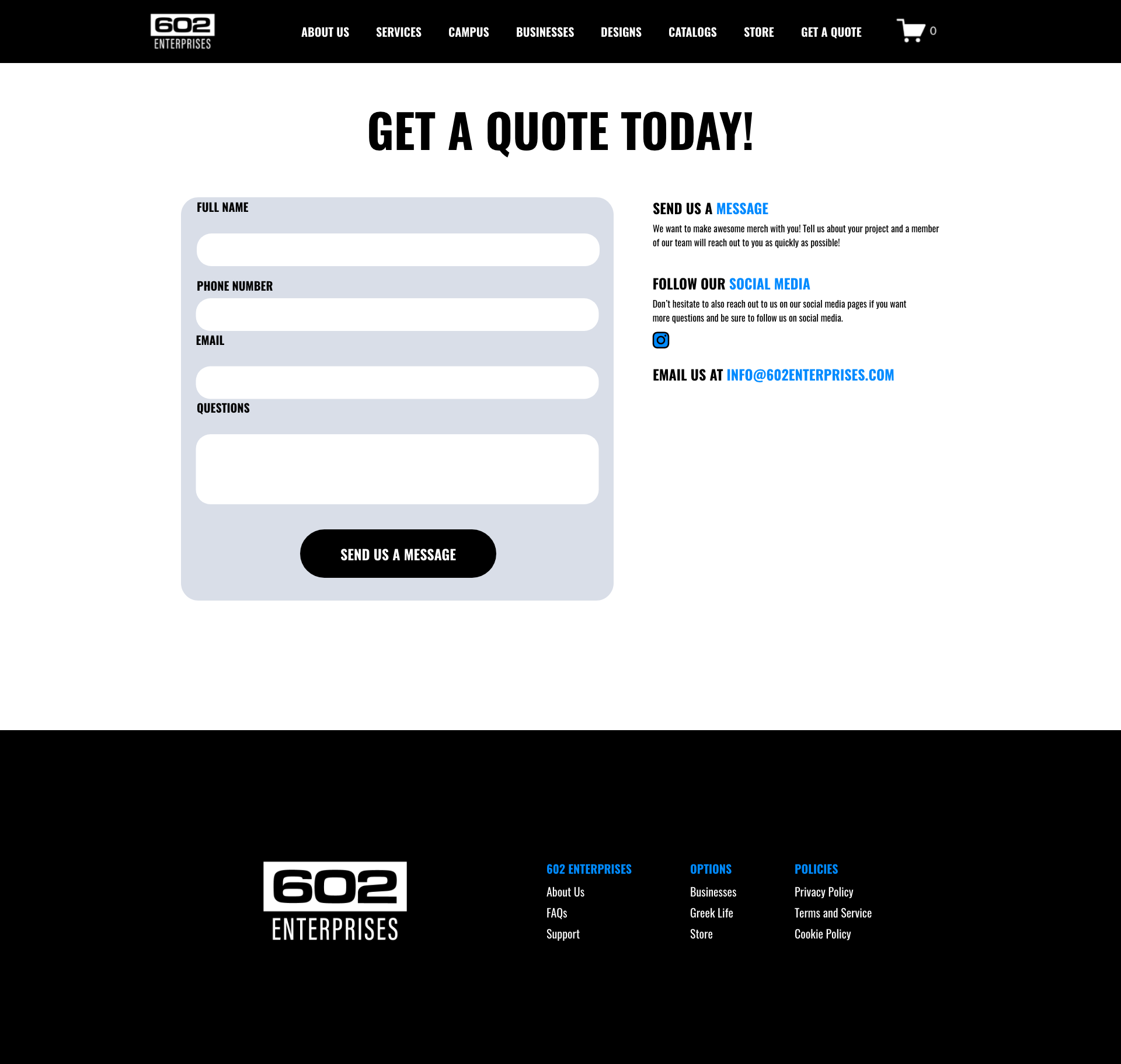
The main colors of 602 Enterprises are black and white and my clients wanted a tone of blue that can complement the black and white. I was able to find a dodger blue color to dominate the page with black and white. Then found two other secondary blue colors to help complement the blue. The typography that I decided to go with was the Oswald font. The reason is that it fits the tone of what the website should be BOLD and LOUD. Customers should see this font and know what this business wants to represent with its services. The icons were designed by myself and all come in 2 sets, for businesses and campus. I also designed a hi-fidelity prototype, to see the full prototype, click the link here!
Color Palette

Typography

Icons
Buttons

Hi-fidelity Design


Step Five: SEO & Website
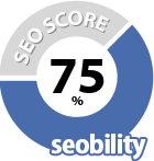
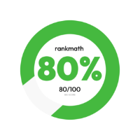
Once I complete the hi-fidelity prototype, I share it with my clients to see how they like it. Once I go over the prototype with them, I ask for any changes, additions, or anything to eliminate. Once we all can agree on the design and that's what they want, I now implement it onto the website. I go through each page then input metatags and add an alt tag to images have to optimize as much seo as possible. I also want to implement keywords that can produce large traffic flows when they google services similar to 602 Enterprises. the SEO at 602 Enterprises was previously at 32% originally to now helping the seo jump to 77% and on the lighthouse is at 92%. The number will continue to increase over time as perform maintenance on the website over time.
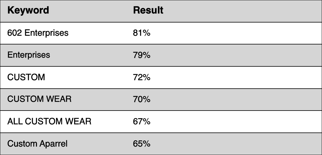
I also wanted to make sure to utilize keywords within the website like custom apparel and all about customs into the website. Custom apparel has a large volume of searches, which was an issue since many people would use this keyword on their website. I did some research and found all about custom wear, which has a low volume in comparison and helps people navigate to their website easier. It also navigates to custom apparel similar to what 602 Enterprises intends to sell. I found specific keywords that can help create traffic flow by mixing low-volume and high-volume keywords.
Final Results
After completing every step, I input everything into the website and make sure the website is responsive and works functionally on mobile platforms. Some challenges I faced during this project, was figuring out a way of targeting both students and businesses at the same time, but with different representations. What I mean by different representation is designing an idea specifically tailored to each target group that will help them do business with both. I was able to design a layout and icons that were tailored to each group. This project was broken down into 3 phases and currently, the phase I designed was the 2nd phase. In the future, I will continue to maintain their website and keep it up to date. By the end, I should already have everything necessary to complete the 3rd stage.
