Spicelopedia
-
Project Summary
- Overview
- Market Analysis
- User Research
- Wireframing
- Styling & Content
- SEO
- Final Results
Crafting an Identity that sets this spice company apart from the competition and produces traffic flow for Sales.
One question I asked myself is how I can deliver a design that spoke with the target audience, worked the way it should, AND made it easy for customers to shop. These were the questions I answered in this project that delivered an identity to a local spice shop that helped drive sales with a design that can resonate with their audience. Not only was I focused on the design, but making sure customers purchase any products with ease, then implemented various marketing strategies that can propel customers into buying. In this study, I work with Spicelopedia in helping them optimize their email campaigns, designing their website, and inputting a variety of strategies that can help optimize their seo and give customers a reason to continue shopping. So lets begin with the first step, Market Analysis.
Step One: Market Analysis
For the market analysis, I wanted to evaluate the different companies that were selling spices and what they did for their user experience on the website. I came across great companies that were local in the Florida region and saw what they did. Then I expanded to small businesses in the united states to see what they did and finally researched larger companies when I typed spice companies. I found great companies with great user experiences that can compete against Spicelopedia but decided to focus on two companies that I can examine and figure out how they create a great user experience and also some things that don't as well. The two primary websites I discovered that rivaled Spicelopedia was Spice Tribe and Spiceology. Both were great websites but different at the same time with each other. I wanted to learn what a small business like Spice Tribe was able to provide on their website and how a larger company like Spiceology. Both were good websites that sold you on using their spices but needed to evaluate more on what aspects of each site worked and what didn't work by creating a criterion table.

Both websites were great user experience and was hard to nitpick issues from each. I found some ideas that I wanted to implement onto the website like an email pop-up for users to sign up, which Spiceology had but spice tribe did not at the time of this study. Also including free shipping on orders over a certain amount of money. Spiceology did not have any free shipping from what I saw. Both contained a great recipe page with filters, tabs for specific sections, and a list of ingredients for the product page. They both were great but had some stuff that may have been missing, which I wanted to include in the website, and also great ideas that worked for the experience. I also created the pros and cons of each website to examine what made that website so good. But also analyzing ways of improving Spicelopedia without making the mistakes the other two websites made.
Step Two: User Research
Understanding the market helps me evaluate what type of people I should center Spicelopedia on and tailor a design tailored to their needs and wants. Since Spicelopedia is a spice company, I have three users in mind that fits the audience that Spicelopedia wants to reach.

Chef
One of the biggest audience groups Spicelopedia aims to push toward is chefs. Whether that is a personal chef or a chef at a restaurant, I want to establish a relationship on how Spicelopedia can meet this audience group in hopes of using Spicelopedia spices for their meals and restaurants.

Casual Chef
People who casually cook for their families or cook for fun and looking to spice up their meals using a Spicelopedia seasoning. This group is our main target group for selling to retail and general use and sales driver that make sure to cater to.

Food Services & Restaraunt Owners
The final audience group gravitates to corporate and culinary food services and restaurant owners that are looking to also use Spicelopedia seasoning for their business and catering service. This group is a secondary target and more so as a stakeholder than anything, but still, an important stakeholder that can expand as a target group.
These are the three main audience groups I wanted to cater to. I also wanted to make them feel comfortable scrolling through Spicelopedia and finding information about the company, ingredients, and spices they want to shop for. I created an empathy map that centers around a specific person and an example of what that person may say, feel, think, and do.
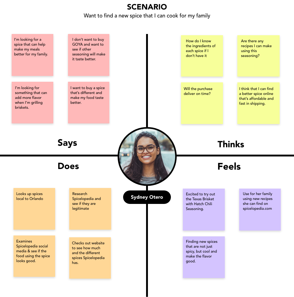
Let's say there is a woman named Syndey Otero, who falls under the category of a casual chef or mostly is looking to cook for fun and her family mostly. Syndey is looking for a spice that is spicy and can be used for briskets to grill. She may like a certain spice that caters to exactly what Sydney wants to cook for herself and her family which will spice things up. I can now empathize with Syndey and help evaluate what I need to make a design that caters to Syndey and people like Sydney. Now that I can empathize with a user I want to create user profiles that can help me even more.

After I created the user profile, I designed a SWOT Analysis that will help me understand the business aspect of Spicelopedia, like Strengths, Weaknesses, Opportunities, and Threats. Making the SWOT Analysis will help me diagnose realistic problems that can face Spicelopedia and also excellent reasons why it will function.
Strength
- An easy path for users to add items to their cart and purchase easily.
- The target audience does not necessarily have a limit and is open to anyone that is looking to make meals using Spicelopedia.
- Optimizing keywords for website and email campaigns that can help raise Spicelopedia's SEO score.
Weakness
- Many people can feel hesitant to purchase spices online, especially if the customer is not local.
- Competitors like Spiceology which are big franchises can be hurdles to jump over in terms of gaining customers.
- Costly for advertising and Google rankings.
Opportunities
- An SEO strategy that produces traffic flow onto the website and social media pages.
- Attract customers beyond the target scope that will make Spicelopedia a legitimate competitor.
- Creating different sales channels leading directly to customers purchasing on the website.
Threat
- Customers shopping in stores may be a threat to someone purchasing from Spicelopedia.
- Spiceology and franchises that sell spices.
- Sales channels can also affect where the user purchases their spice.
Step Three: Wireframes

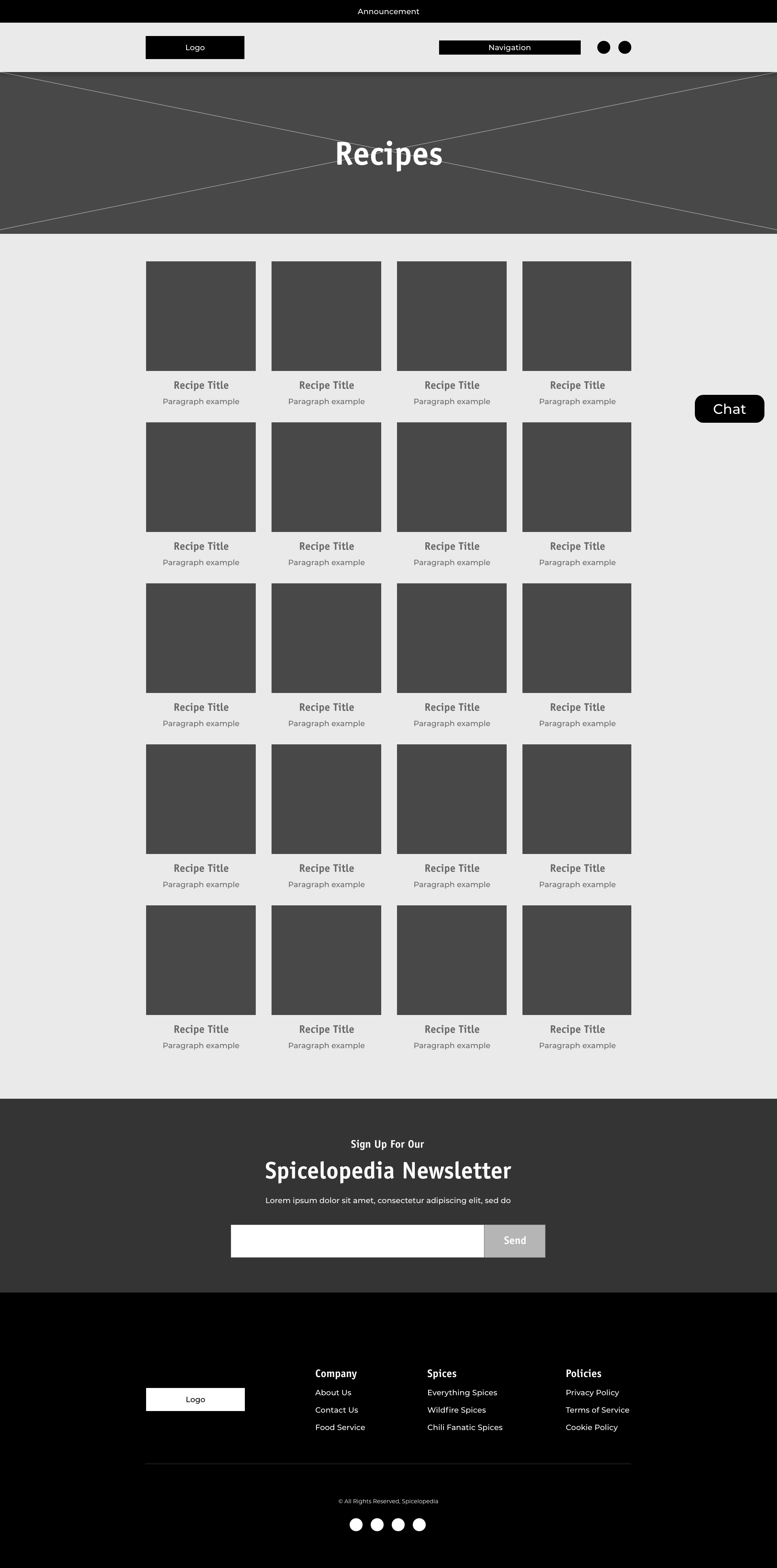
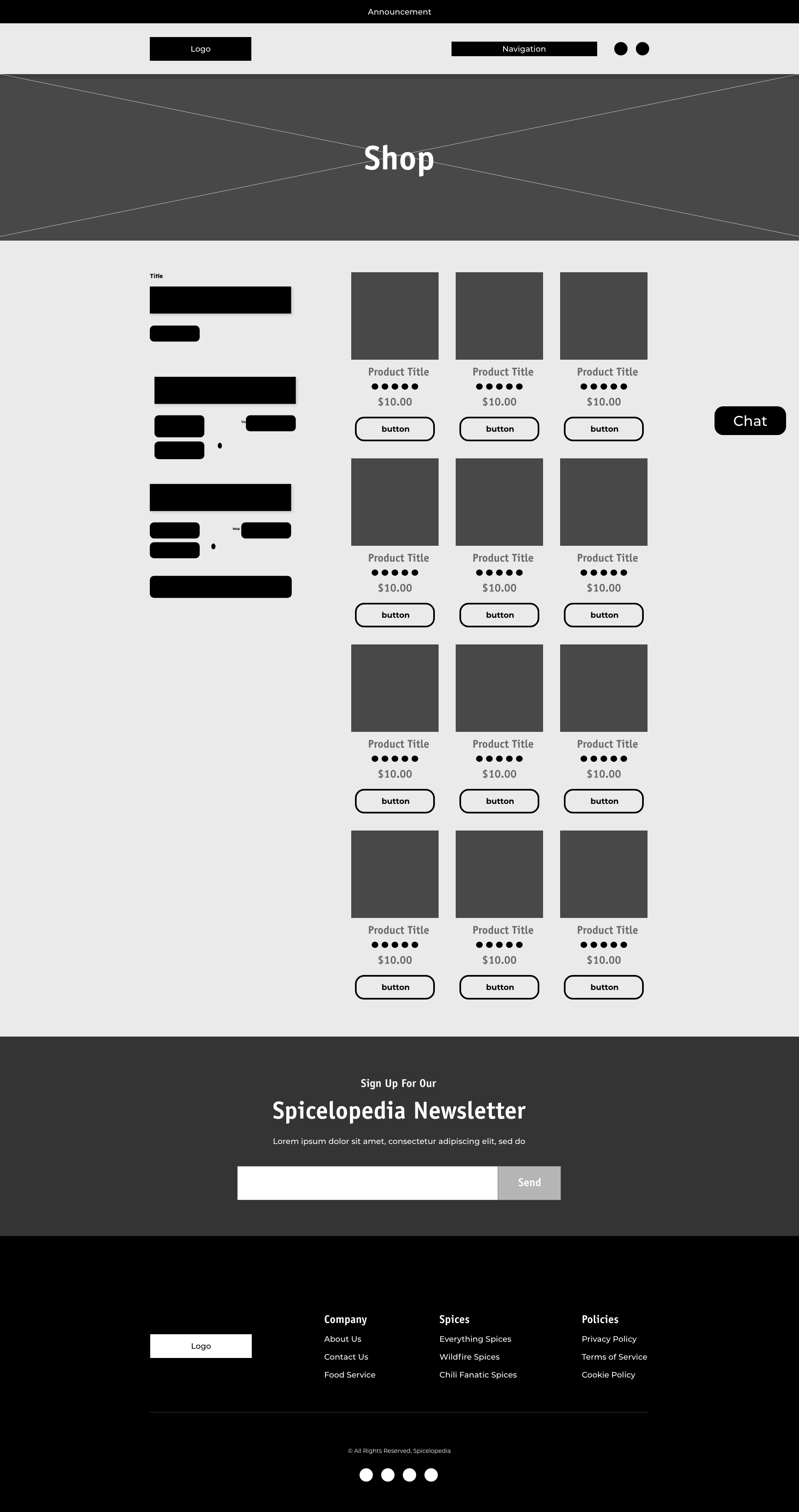
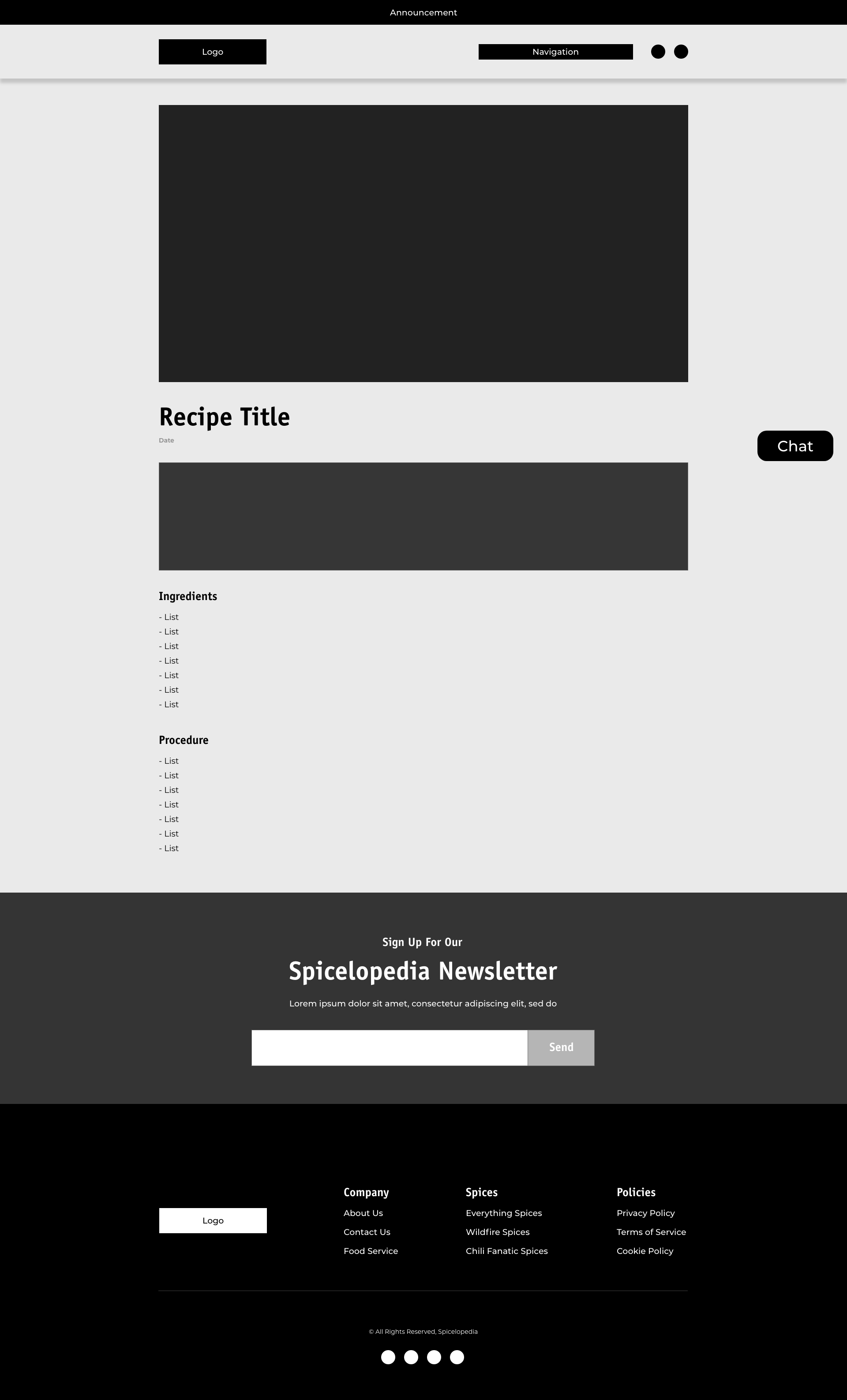
I laid out the website that fit the client's view and a design that catered to the target audience. I figured out the navigation and made it with simple pages like the landing page and the about us page. Since this is an E-Commerce website, it's important to include a shop page that allowed users to purchase Spicelopedia's seasoning and merchandise. Also, include a recipes page to help users figure out different meals to cook from Spicelopedia. I also made sure to have a search, cart, and in the future create a profile icon. Each page has specific information by building a structure to help me design the website. To see more in-depth architecture.
Artboards



Step Four: Styling & Content
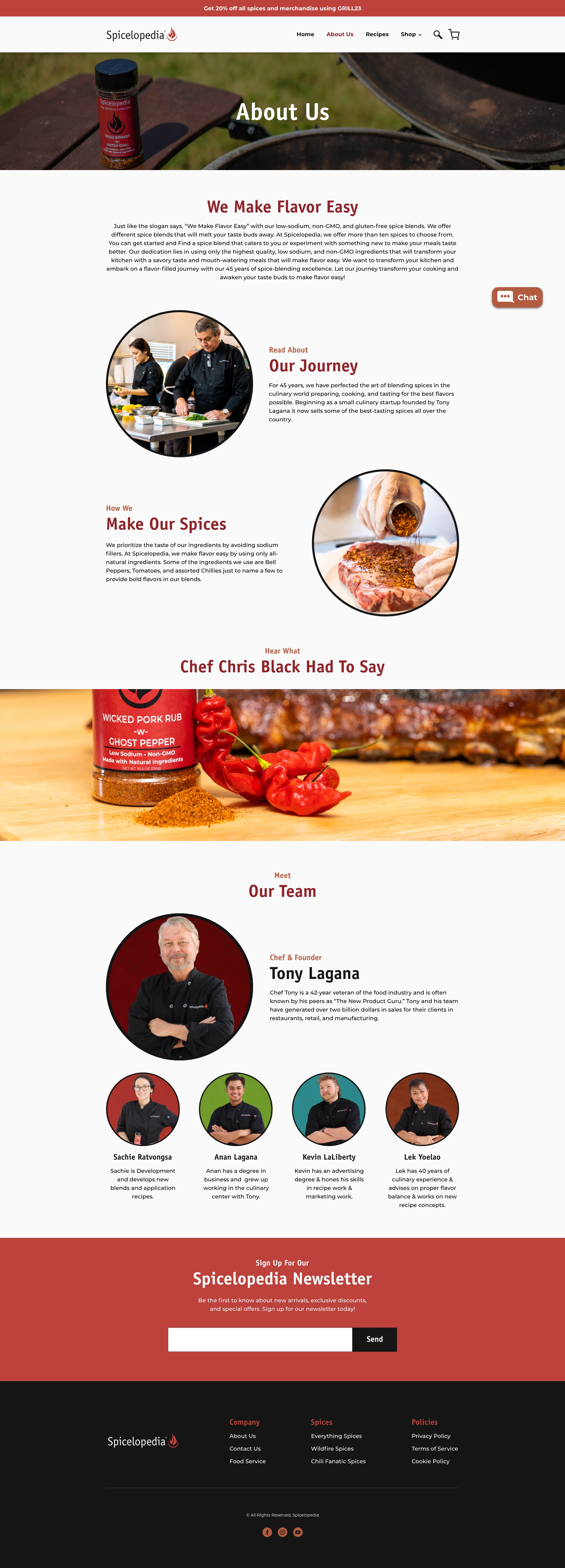
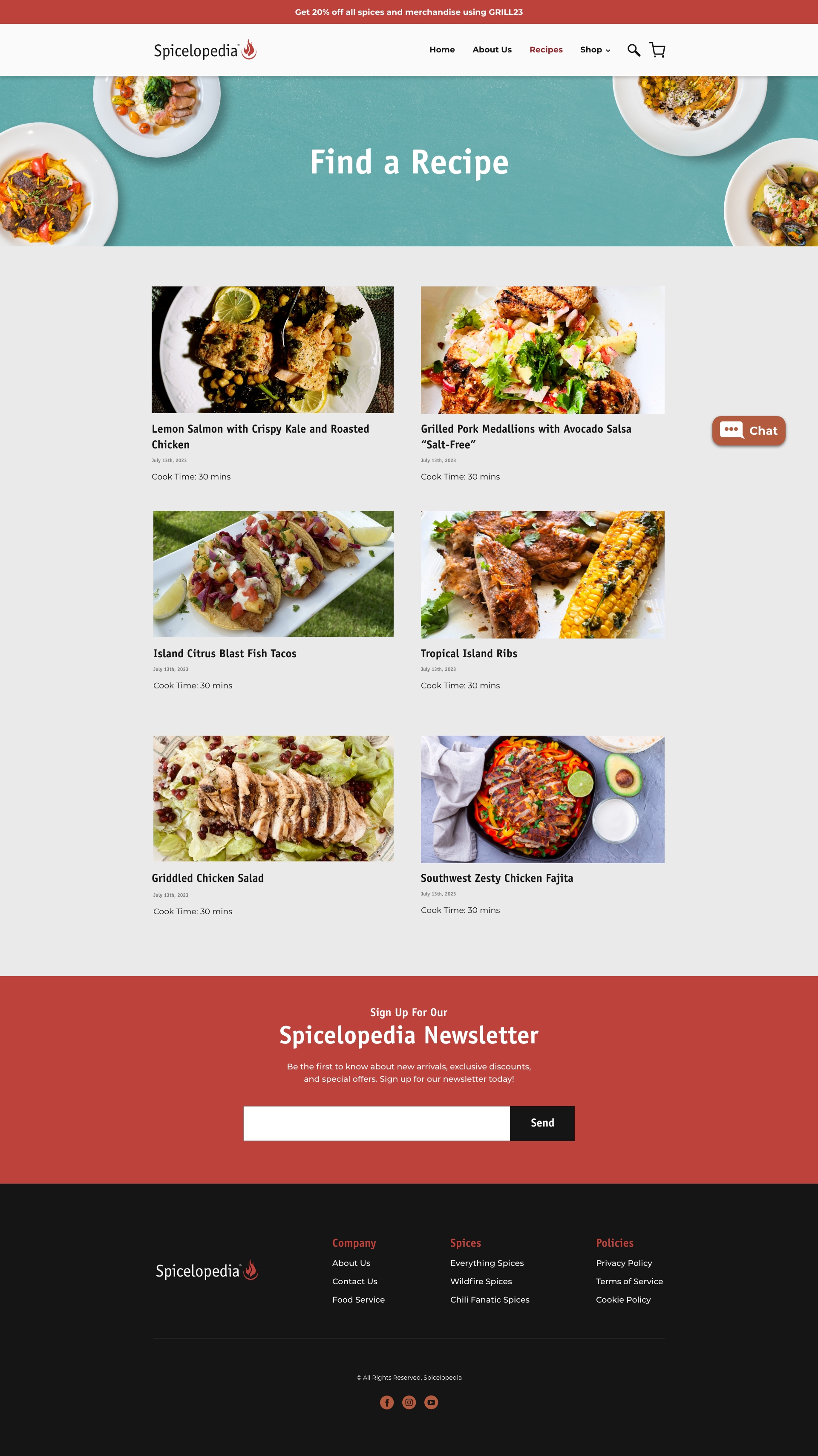
The main colors of 602 Enterprises are black and white and my clients wanted a tone of blue that can complement the black and white. I was able to find a dodger blue color to dominate the page with black and white. Then found two other secondary blue colors to help complement the blue. The typography that I decided to go with was the Oswald font. The reason is that it fits the tone of what the website should be BOLD and LOUD. Customers should see this font and know what this business wants to represent with its services. The icons were designed by myself and all come in 2 sets, for businesses and campus. I also designed a hi-fidelity prototype, to see the full prototype, click the link here!
Color Palette

Typography

Icons
Buttons

Hi-fidelity Design

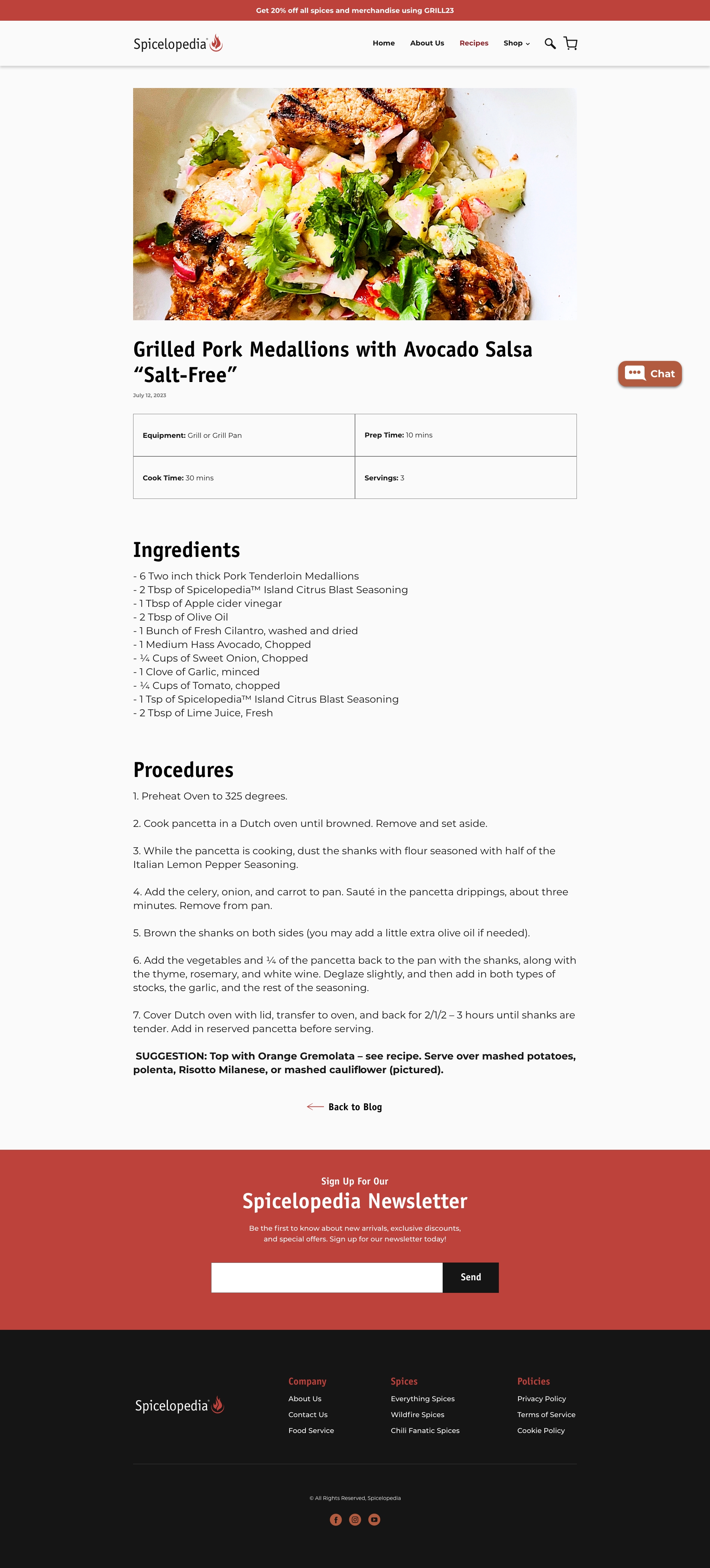
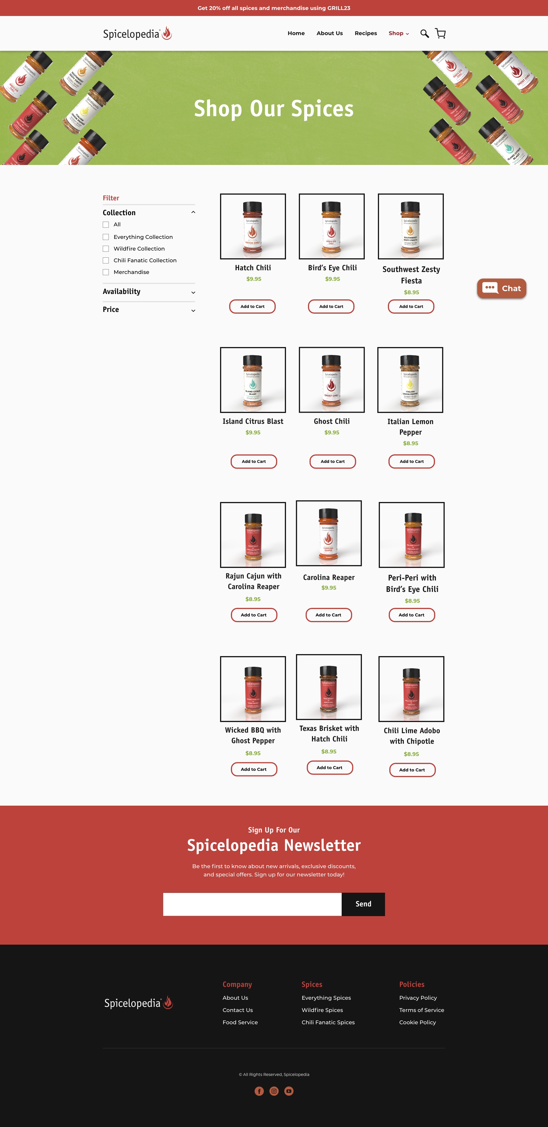

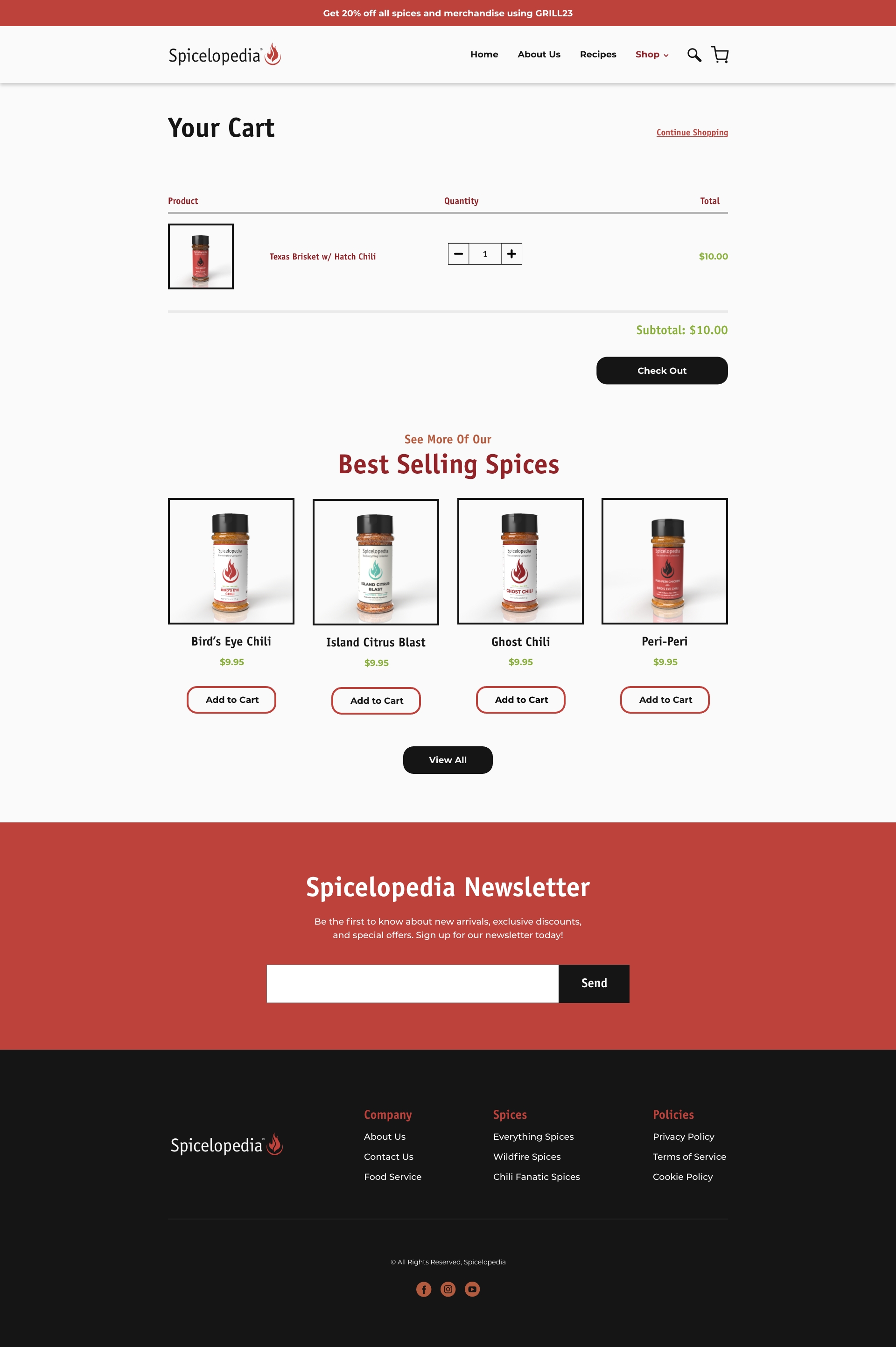
Step Five: SEO & Website
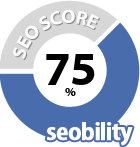
Once I put everything together onto Shopify, I want to make sure that all the content is Optimized when customers look up Spicelopedia. I make sure that I push certain keywords that will be informational, navigational, and transactional. I helped Spicelopedia go from 51% to 75% SEO optimized and helped push them above the top of the search rankings. Spicelopedia sales spiked by 20% thanks to the optimization of SEO and backlinks that helped customers get to purchase spice bottles.
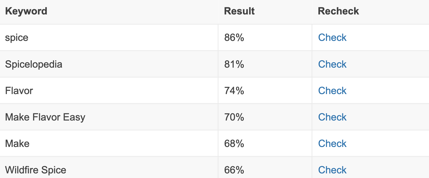
I also wanted to make sure to utilize keywords within the website like their tagline "We Make Flavor Easy" and product names in the website. There was low competition against some of their product names such as Rajun Cajun and Carolina Reaper, which ranked at the top of Google. I found specific keywords that can help create traffic flow by mixing low-volume and high-volume keywords.
Final Results
This was one of the most enjoyable moments of my career and was an absolute blast designing the website from scratch and implementing it onto Shopify. It was also a great experience that helped me learn beyond web design and the analytics, sales, and business side of everything. I continue to work with this company to make sure their website is up to date as well as maintain their social media and email campaigns
